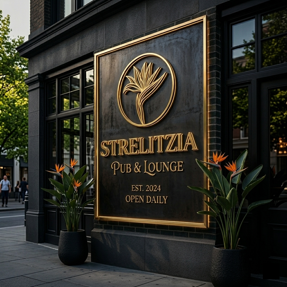
The Strelitzia Pub project is more than just drawing a flower; it is about sculpting an iconic symbol. This branding journey explores the transition from vibrant tropical beauty to a silent, deep, and "high-end" visual language, tailored specifically for an elite nightlife atmosphere.
Context
Background
Strelitzia (Bird of Paradise) is naturally wild and colorful. The challenge was to “deconstruct” this organic form into a minimalist geometric emblem. The brand identity needed to evoke the luxury of a premium pub while maintaining the unique DNA of the tropical flower that gives the venue its name.
Details
Role:
Lead Brand Identity Designer
Involvement:
Logo Construction, Custom Typography, Visual Depth Strategy
Vision
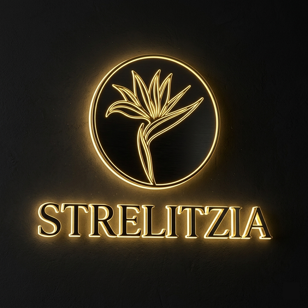
Our vision followed the “Less is More” philosophy. By stripping away the literal details of the flower, we focused on the “Upward Sweep”—a movement representing growth, leadership, and the opening of a bird’s wings. The logo tells a story of elevation and elite status through sharp, monochromatic line art.
Challenge
How to make a tropical-inspired logo feel “at home” in a dark, high-end environment? The design had to be versatile enough to maintain its integrity on massive building facades while remaining delicate when embossed on premium leather coasters or glassware.
Solution
The design system balances rigid structure with emotional fluidness, specifically calculated for nighttime visibility.
Golden Ratio & Line-Art: Every curve is aligned to a strict geometric grid, ensuring absolute visual balance.
Firm & Fluid Interplay: We combined sharp vertical axes to represent professional service with wave-like strokes that evoke the flow of music.
Nighttime Visual Depth: Using Negative Space, the logo is engineered to "live" in low-light environments.
Results
Strelitzia Pub’s identity is a testament to the power of minimalist deconstruction. It successfully transforms a wild botanical element into a sophisticated architectural emblem. The result is a brand that doesn’t just attract customers—it defines a lifestyle of elite relaxation.
Strelitzia Pub – The geometry of night, the art of the elite.