
The HANOI LAKES logo is not merely a graphic symbol but a work of Technical Line Art, crafted to honor the heritage beauty and the connecting spirit of the capital. This design is the perfect choice for brands aiming for luxury, sustainability, and a deep cultural narrative.
Context
Background
Hanoi is a city of bridges and lakes. The project sought to encapsulate the structural soul of iconic landmarks like Long Bien and Nhat Tan bridges into a minimalist identity. The goal was to transform heavy steel structures into a “Visual Dance” that reflects the constant growth of a modern business rooted in tradition.
Details
Role:
Visual Identity & Technical Artist.
Involvement:
Minimalist Geometry, Technical Line Art, Luxury Positioning
Vision
The vision originates from the “Bridge” metaphor—a witness to history and a symbol of connection. We used Minimalist Geometry to translate technical steel components into symmetrical triangular blocks. The logo acts as a silent commitment: connecting the past to the future, and the brand to its customers.
Challenge
How to balance the inherent rigidity of technical architecture with the fluid, poetic nature of Hanoi’s lakes? The design needed to maintain a sense of “Minimalist Authority” while ensuring it felt “breathable” and elegant enough for high-end Real Estate and Resort sectors.
Solution
The structural integrity of the logo is achieved through three core pillars: Linear movement, Sophisticated typography, and a Luxury color palette.
- Linear Geometry : The bridge structure is simplified into a linear strip, evoking a gentle movement like light dancing on a lake. It also hints at mountain peaks reflected in water, harmonizing Architecture with Nature.
- Sophisticated Typography: Using a modern Serif typeface with wide kerning. This "breathable" layout creates a sense of solemnity and prestige, anchoring the technical icon with a stable base.
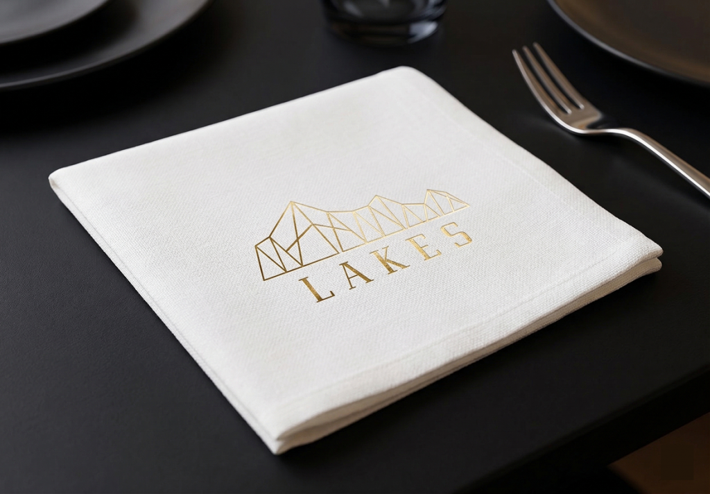
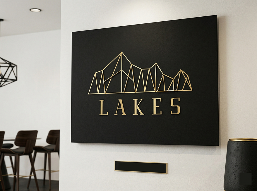
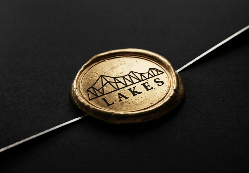
- Luxury Gold & Monochrome Palette: Gold symbolizes prosperity and the golden hour sun over Hanoi's bridges. Combined with Monochrome (Black/White), it ensures absolute contrast and maintains artistic integrity even at the smallest scales.
Results
HANOI LAKES is more than a logo; it is a versatile identity ecosystem. Its high applicability makes it the ultimate choice for Luxury Resorts, Real Estate projects, and Architectural firms that value geographic heritage. Whether embossed on premium paper or laser-engraved on metal, the brand speaks the language of timeless elegance.
HANOI LAKES – Where technical precision meets millennial heritage.