
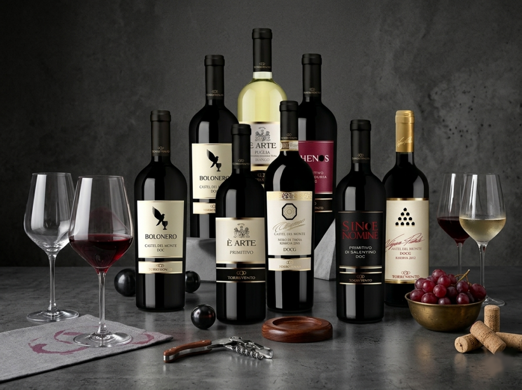
The Torrevento label collection is designed as a storytelling ecosystem, where each bottle is not just a product but a symbolic narrative of Italian heritage. Moving beyond traditional winemaking aesthetics, this project focuses on translating the "soul of the land" into a sophisticated visual language that balances power, art, and mystery.
Context
Background
Torrevento is a prestige Italian winery seeking to redefine its visual identity across diverse product lines. The goal was to create a “Visual Soul” for each series—from minimalist authority to Renaissance-inspired elegance—while maintaining a cohesive brand architecture that speaks to high-end global consumers.
Details
Role:
Logo & Packaging Identity Designer
Involvement:
Visual Strategy, Label Design, Material Consulting
Vision
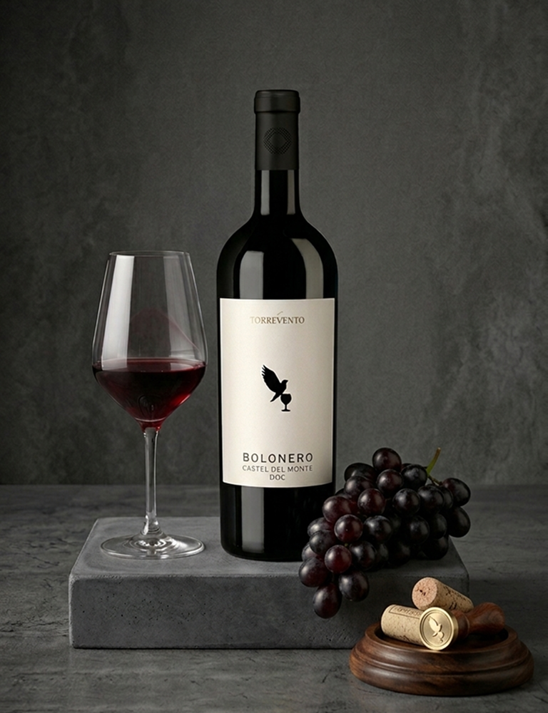
The concept originates from the philosophy that “Each label is a symbolic story.” We treated every wine series as a unique character: the Eagle for authority, the Crest for art, and the Matte Black for mystery. The vision was to transform a physical bottle into a gallery-worthy piece of art through visual rhythm and premium textures.
Challenge
How to create a diverse portfolio that ranges from “Minimalist Authority” to “The Gold Standard” while ensuring the “Torrevento” mother brand remains recognizable? Additionally, the design had to integrate complex printing techniques like foil stamping and embossing without losing the modern, streamlined demeanor.
Solution
The system is divided into four distinct strategic pillars, each utilizing specific geometric and material languages to evoke emotion.
- Minimalist Authority: Utilizing ivory space and the "Black Eagle on Holy Grail" icon to create a sharp contrast, representing purity.
- Renaissance Modernity: Implementing layering techniques and wide kerning to mimic Italian museum frames, creating a relaxed yet high-end feel.
- Tactile Mystery: Applying matte black backgrounds with 3D concentric textures and leather-like finishes to stimulate the sense of touch.
- The Gold Standard: High-precision foil stamping on octagonal structures, signaling top-tier DOCG quality through meticulous detail.
Results
Overall, the Torrevento identity system does not just sell wine; it offers a premium experience of Italian culture. By combining systemic thinking with printing expertise, we created a visual ecosystem where every curve is a journey and every label is a marked moment of heritage.
Torrevento – Beyond the Bottle. It’s the art of the land, captured in a frame.