
Branding is more than just visuals; it’s about storytelling the Ha Giang identity through modern packaging language.
Context
Background
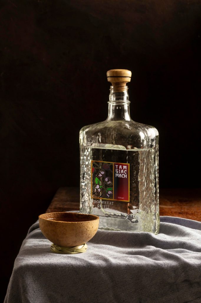
The Tam Giac Mach wine project posed the challenge of positioning a traditional product into the premium segment. The goal was to create an appearance competitive enough with international spirits brands while fully retaining the “breath” of the nation’s northernmost land.
Details
Timeframe:
Jan 2026 – Mar 2026
Role:
Brand Designer, Packaging
Involvement:
Web Interface, Branding, 3D Mockup
Vision
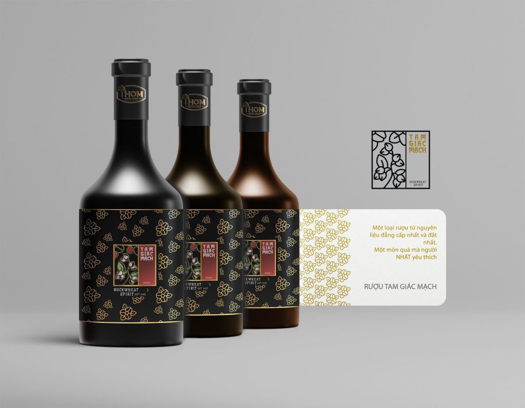
We aimed to create a distinct identity where the buckwheat flower is not just a flower, but a consistent graphic symbol. The design focuses on minimalism to highlight the craftsmanship and the rarity of the ingredients.
Challenge
How to modernize ethnic patterns (brocade, motifs) without losing their authenticity? The challenge lies in balancing “Folklore” and “Luxury” elements to reach high-end customers.
Solution
Using minimalist Line-art techniques to recreate the buckwheat petals, combined with the muted color palette of karst rocks and the signature purple hue. Every touchpoint, from the bottle label and neck tag to the paper packaging, is meticulously calculated based on the golden ratio. satisfaction with which customers can interact with the brand’s products or services. Good UX is crucial in digital branding.
- Community: The design creates a connection between consumers and highland culture.
- Emotion: The packaging visuals aim to touch the emotion of "savoring" rather than just "drinking".
- Consistency: The brand identity system works effectively across all platforms, from print to website.
Results
The project successfully built a cohesive and inspiring brand story. The packaging set not only helps increase brand value but also becomes a prime example of elevating Vietnamese agricultural products to a premium level through professional design.
Brands need to evolve over time to maintain their position. This means always being open to changes while holding tightly to their cultural “roots”.