
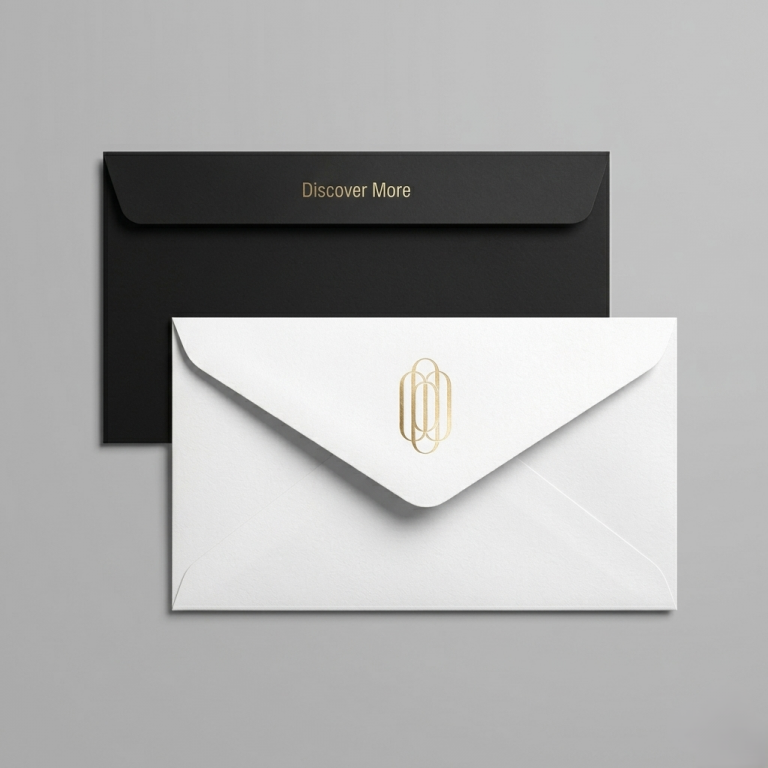
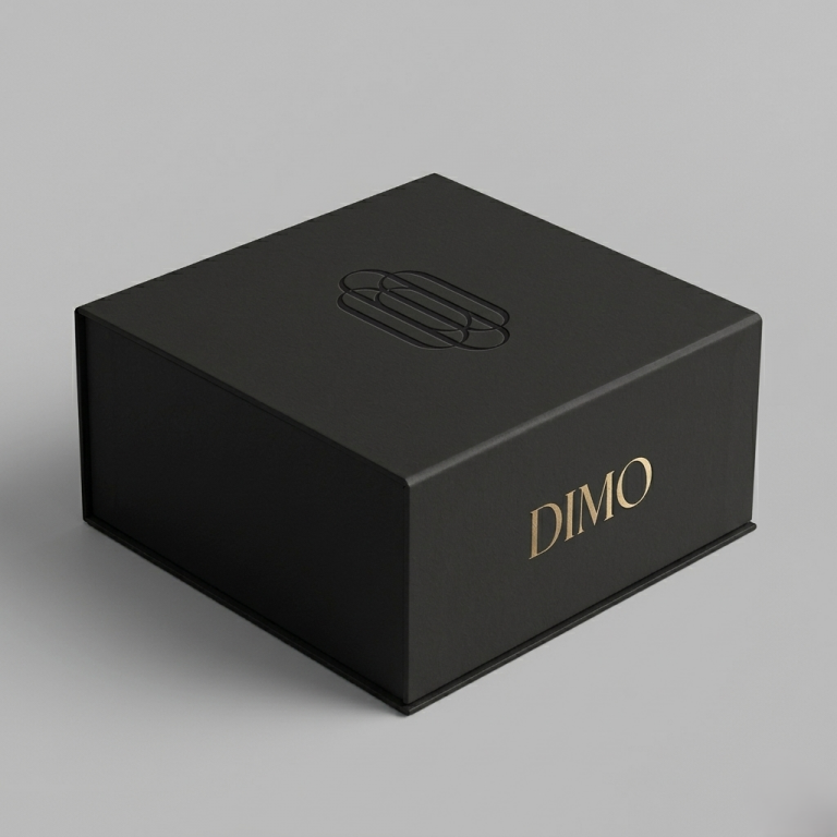
The DIMO logo is designed as a kinetic geometric system, representing the spirit of exploration and connection in travel experiences. From the beginning, the logo eschews familiar literal illustrations, focusing instead on translating the brand name into a modern, refined, and visually deep language of lines.
Context
Background
DIMO is a travel brand positioned around modernity and freshness. Unlike traditional brands, DIMO’s identity needed to avoid clichéd imagery (like airplanes or globes), and instead evoke the flexibility, the rhythm of journeys, and the personal experiences of the traveler.
Details
Role:
Logo & Brand Identity Designer
Involvement:
Logo Design, Typography, Visual System
Vision
The concept of the DIMO logo originates from abstracting the four letters D – I – M – O. Each letter is treated as a basic geometric unit, which is then restructured to create a seamless flow of movement. The logo tells its story not through specific images, but through visual rhythm and structure.
Challenge
How to create an emblem that is both kinetic and stable when applied across multiple platforms? Additionally, the design had to express the softness and friendliness of the service industry while maintaining a modern and streamlined demeanor.
Solution
The emblem’s structure is formed by four vertical axes with rounded ends and uniform stroke ratios, arranged in an interlocking manner to create a sense of light, controlled movement.
- Visual Depth: The intersections between the curves are intentionally kept to create layering and a subtle overlapping effect.
- Linework: All lines are rounded to eliminate any harsh or sharp feelings, bringing a sense of friendliness.
- Typography: The DIMO logotype uses a modern serif typeface with moderate contrast, perfectly balancing the softness of the emblem above.
Results
Overall, the DIMO logo does not represent a specific destination but reflects the human journey of movement and experience. Every curve is a journey. Every intersection is a marked moment. This open identity system allows viewers to interpret it according to their own personal feelings.
DIMO – Discovery More. Not just travel, but the way humans explore the world and themselves.